Jameson is all about style, character, and attention to detail.
That’s why the foundation of our work on the brand zone was the desire to create a unique space that fully conveys the spirit of the brand.
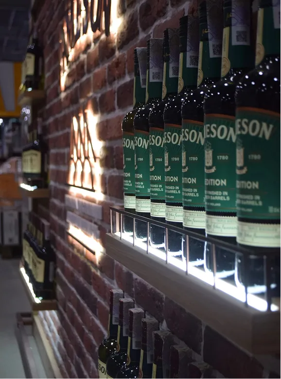
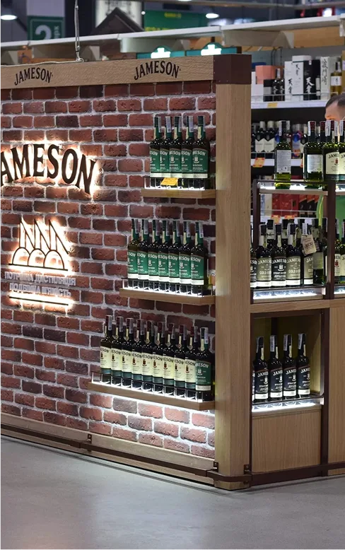
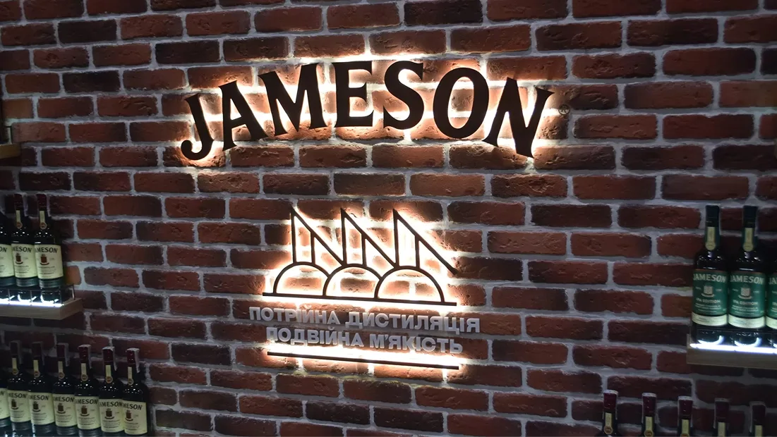
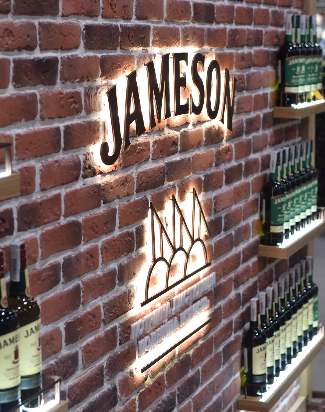
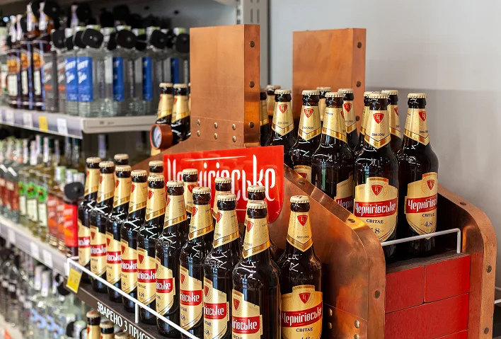
The client came to us with a clear vision, which we transformed into a thoughtful and cohesive solution. At the core of the concept are materials that highlight authenticity (wood, copper, plastic, acrylic), brand colors (shades of red and green brick, oak texture, glass transparency), and visual references to the brand’s previous implementations.
We worked with distinctive shades and textures, combining them into a balanced composition. The space gained depth and character through a mix of gypsum tiles, veneered chipboard, copper-textured metal, acrylic, PVC, plywood, and textile inserts.
The atmosphere is enhanced by integrated LED lighting.
Client: Pernod Ricard
Year: 2021